Cropped image from Itch outdoor campaign by NOW

Itch – Killing It Right. NOW.

London Creative Agency’s Campaign is Long in the Face

This advertising campaign in the London Underground stopped me in my tracks. Not literally – the posters were on the walls along the fast-moving escalators down to and up from Underground stops – but definitely in terms of snagging my attention.

Maybe it’s the eyes, so expressive of adoration and love, discomfort and sometimes even mischievousness.

Maybe it’s the noses. I can almost feel the cool dampness.

Or maybe it’s just the fact that they’re dogs and cats, for cryin’ out loud.

For me, it’s all of those, plus the clever use of the animals’ breed names in the headlines.

Love it.

Whatever makes it so arresting, the campaign is for itch., which develops and sells flea and other treatments for humans’ best friends. The company developed the campaign in collaboration with London-based creative agency NOW.

Not only did it grab my attention, but it made me stop and think about our dog and whether we’ve treated her properly. Which is the point.

“Charlotte Harper, Chief Marketing Officer at ITCH, says: ‘ITCH was launched with the aim of infusing the pet care market with a massive dose of personality, whist offering pet owners direct access to the best personalised flea products for their pets… We wanted a unique, playful and unforgettable ad and NOW have really delivered on our brief to delight and scare us!’ said Charlotte Harper, Chief Marketing Officer at ITCH.”

Check out  itch.’s Instagram for better images and more of them, read more about it in the Marketing Communication News and check out what NOW has to say about bringing out the brilliance to kick out the fleas.


Forgive the quality of the images. Like I said, the escalators were really moving.

Poster of Shih Tzu for advertising campaign


Poster of Labrador advertising flea treatment


Poster of cat advertising flea treatment


Poster of Whippet advertising flea treatment

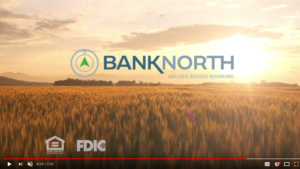
BankNorth TV - BankNorth in South Dakota: Values-Based Banking by Fredricks Communications

BankNorth in South Dakota: Values-Based Banking

For the first time in its nearly 115-year history, BankNorth has moved beyond the borders of its home.

BankNorth TV - BankNorth in South Dakota: Values-Based Banking by Fredricks Communications

Click image to watch TV spot.

Today, First State Bank of Warner, S.D., opened its branches in Aberdeen and Warner, S.D. with its new name, BankNorth. The acquisition announcement is supported with print, radio and television ads, media relations and direct mail. Fredricks Communications provided connecting, scriptwriting, art direction and project management services.

The message –

“First State Bank of Warner is Now BankNorth, and we’re excited about the direction we’re headed. We’ve been First State Bank of Warner for a long time, and over the years, honesty, loyalty and integrity have been our guide. We’re still the same people in the same locations, and those same values still drive how we work with you every day.”

The acquisition announcement is part of a larger rebranding campaign for BankNorth, which was formerly First State Bank of North Dakota. Check out additional campaign elements and the new BankNorth website.

Thank you to BankNorth for allowing Fredricks Communications to be part of this project, and to all Fredricks Communications partners who helped pull everything off so beautifully: Bock’s Office Transformational Consulting, Creative Monke, Kelner Communications, Knight Printing, Midco, Solberg Design and Video Arts Studios.

Tip Tuesday – Advertising Copyriting: Keep It Brief

Old-style ink pen writing "Tip Tuesday" on paper

Enough said.


Or, if you want more detail, here it is –

Like all of us, members of your target markets are bombarded by thousands of marketing messages every day. And, also like all of us, they have less than zero time to burn and are not likely to take much of it to read advertising/marketing copy.

It’s the “Get in, get out and live to fight another day” of advertising/marketing messaging:

  • Grab attention.
  • Deliver a compelling message quickly.
  • Close with a strong call to action.

So. There you have it.

As I said, enough said.